I recently shopped with http://www.waitrose.com for my grocery shopping and opted for their myWaitrose loyalty programme. Few days later, I received my very own myWaitrose card along with a booklet and I just couldn’t resist sharing their lovely communication pack.

There are a lot of reasons I feel attached to this brand, however first let me take you through some of the words that have been used in the letter that instantly connect me as a customer/user with their values. “Rewarding”, “Convenient”, “Member-only benefits”, “Get things for free”, “Save money”, “Attach a fob to your keys for extra convenience” and “It’s much more than just a loyalty scheme”.
The content is exceptionally well written, focuses on keywords that are relevant to the customer and doesn’t comes across too sale driven.
Moving on to the booklet, the cover is very welcoming with a well composed photo of fresh hand-picked apples on a pleasing green background of leaves. I’m urged to open it.
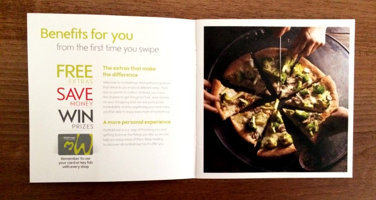
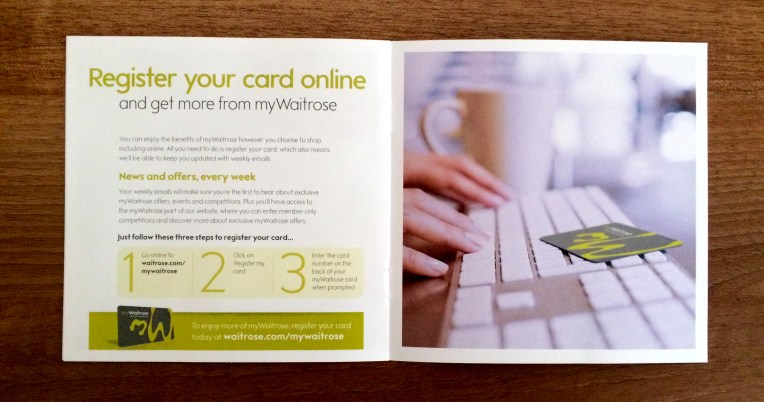
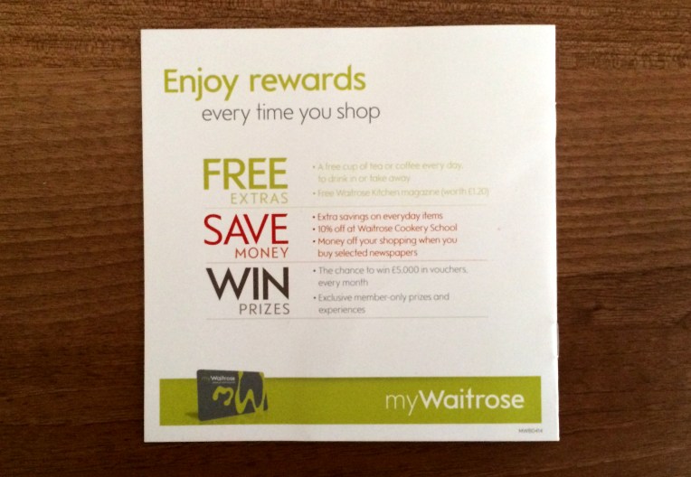
The pages inside re-iterate the benefits of the programme to the user with clear calls to action. And the back cover of the booklet simply summarises key points again as an effective sign-off.
The same compelling user experience is then carried on to the landing page for registering my card. The use of consistent content, colours and images provides a smooth shift from the offline to the online digital medium.
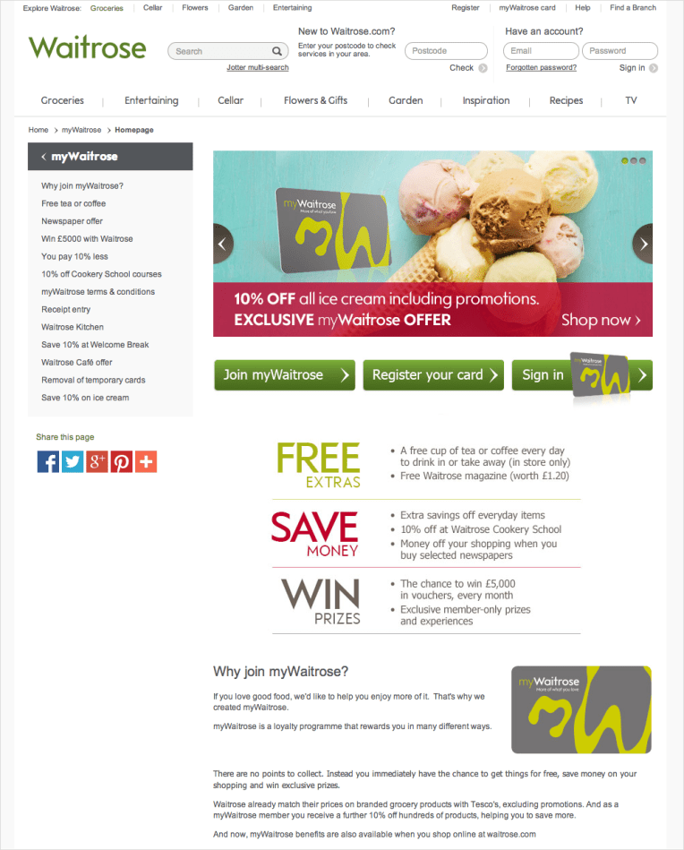
To summarise, myWaitrose loyalty programme team have achieved a seamless, integrated and consistent user experience, from the point a customer receives the pack to the point they visit the online landing page and complete their registration.
